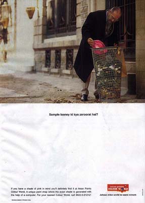

Headline: Sample laaney ki kya zaroorat hai?
Bodycopy: If you have a shade of pink in mind you'll definitely find it at Asian Paints Colour World. A unique paint shop where the exact shade is generated with the help of a computer. For your nearest Colour World, call 9622-0-21212.
Baseline: Jahaan milen world ke saare colours
AGENCY: O&M
Product: Asian Paints Colour World is the brand name for the one-stop colour shop of Asian Paints, which are unique paint shops where shades are generated with the help of a computer with software to choose and select 1,511 shade combinations, designed to reach consumers in a direct `dil se' style.
Advertising Objective: Position Asian Paints Colour World as the ‘one stop paint shop’ with all the colours one could want. The advertising should create enough interest in potential consumers to ensure that they come to the Asian Paints Colour World outlet or at least call the Asian Paints helpline.
Target Audience:
Demographics
Region: India, urban population
Occupation: Service/working professional/self-employed
Gender: Male
Religion: Insignificant
Social class: Upper Middle and upwards
SEC: B and upwards
Family life cycle: Middle aged
Behavioural
Occasions: When looking to paint the interiors of his house (usually
there is an upsurge with new construction and during festive seasons like
Diwali and Holi)
User status: First time user
Loyalty status: Not defined
Readiness Stage: Relatively informed
Attitude toward product: Low-involvement
Attitude toward brand: Trusting, has high-recall value
Key Consumer Benefits
Proposition
The outlet allows the consumer to get ‘just the right shade’
Support
Asian Paints has the largest range of colours in the market (e.g. Over 127 shades of green, 206 shades of blue, 118 shades of yellow and many others) and the outlet allows the consumer to choose any among a vast range of colours with the help of a computer.
Tone and Manner
The tone of the advertising should be educative yet appealing. It should touch a chord in the reader’s heart so that he identifies with the communication and sees it as speaking directly to him.
Other Considerations
· Use the colours, logo and symbol of Asian Paints and Colour World, which are a pneumonic essential to all brand communication.
· Keep in mind that the advertisement should be in line with the overall communication strategy of the brand and primarily should support the proposition advertised in the current television commercials ‘mera wala cream’, mera wala pink’ and ‘kathakalli dancer’ (TVCs will be sent for your perusal).
· During primary research we noticed that persons during the phase of getting their house painted look for just the right shade and are prone to collecting samples to visually show their painter exactly what they had in mind and cannot always express verbally. If this insight is useful, you may incorporate it in your advertising.
As can be seen from the Creative Brief, the ad is strategic in nature,
being a part of the Asian Paints campaign promoting Asian Paints as the
brand with the largest range of colours and one that will satisfy the consumer
and is able to give him precisely what he wants. The advertising through
the campaign is single-minded and focussed in its proposition, communication
and target audience. The campaign included TVCs and other print advertisements
as part of the same communication.
At the time, Asian Paints had 13 brands with over 1,100 shades, targeting different niches. They were beginning to realise that though some brands like Apex emulsions, Royale interior emulsion, Apcolite and Touch Wood had high recall; none except Tractor distemper were almost generic. Therefore, they decided to promote the corporate image and the various brands under their umbrella brand ‘Asian Paints’ through their communication, pushing the generic Asian Paints brand instead of pumping in investment on individual brands. This leveraged on the advantage that Asian Paints was the one company in this low-involvement segment where people actually asked for the paint by brand, breaking away from the earlier tradition where consumers were not known to be very brand-conscious in this low-involvement segment and, more often than not, relied on what the painter bought for them within the budget allocated, being more specific about the colour than its source.
o Excellent use of layout and colours, including camera techniques (focus and aperture in the image) ensure that the viewer’s eye moves just as desired from image to headline to the sub-headline and finally to the body copy.
o Good use of space to do justice to all the elements of the ad in order that it not look cluttered or messy and promotes recall by reaching out in a way that makes one smile.
Ad objective
o The advertisement successfully incorporates the objective of reaching out and touching the consumer by the use of the insight of how persons in the phase of searching for the right shade of interior paint are prone to bringing samples to show their painter visually exactly what they can’t otherwise express verbally.
Headline
o The use of Hindu as a language in the headline and sub-headline, even though the ad in question is published in the Reader’s Digest (March 2000 issue) Indian edition, is judicious in that a large majority of the reader’s would not only understand the language but perhaps even find it more endearing, even as it goes with the corporate image of the ‘Indian-ness’ of the brand, right down to Gattu, the mascot.
Media channel
o The use of the particular media channel of Reader’s Digest also reaches
out to the target consumers in terms of their potential as possible converts
from low involvement purchasers.
(Note – The English edition of the Reader’s Digest at the time had
an audited circulation of 405,073 the majority of whom belong to SEC C
and above.)
o The ad itself shows the image of a man who the readers would find
it easy to identify with.
(Note – 57% of reader’s of the publication are between the ages
of 35-54)
o The time of publication of the advertisement (March 2000) also coincides with the purchase occasions of the product. Demand for paints is seasonal in nature - low during monsoon, high during festivals. The growth in the construction activity leads to first-time demand for the new structures coming up. The re-painting, or replacement, demand arises usually during festivals, when people paint their homes. The ad was published just before the Holi, which incidentally, is also a festival of colours.

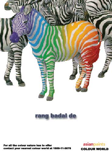
Headline: rang badal de
Bodycopy: For all the colour nature has to offer contact your nearest colour world at 1600-11-5678.
AGENCY: A&M
Target Audience
q The primary target audience for all of the brand’s marketing and communication activities has been the adult male who is the primary decision maker on the brand of paint used. However, the female members of the house play a very significant role in the selection of shades, a fact they have leveraged through a series of ads over the last decade aimed at the female shopper. By not showing any particular individual in the image, the advertisement aims to cut across and appeal to the various niches of the target consumer.
Bodycopy
q The non-use of caps in the headline as in the original ad is in line with the ‘asian paints’ logo, which is in a similar font. This style has been incorporated in the ‘colour world’ logo designed in this ad as well. This design is also meant to allow better readability because of the structure of the colours used.
q The use of the toll-free number is very strategic and part of the overall corporate image. The company, which currently has a turnover of Rs1,300 crore, set up India’s first paint helpline (1600-11-5678) in April 2000 in 20 major cities, which gained a considerable foothold in SEC A/B homes, for whom painting the house was not just slapping whitewash on the walls. The helpline answered questions on shades, subtle colours, prices, combinations, maintenance, home décor, moods etc. – information that a consumer would have to do harrowing research to get.
Thus, for the customer the best advice was just a call away. For Asian Paints, a sale was also just a phone call away. In the case of Asian Paints they already had a loyal customer base. For them, the toll-free number was an add-on to formidable brand equity. The toll free number is used instead of the given number in the bodycopy.
Pneumonics
q The company’s mascot ‘Gattu’ (designed by R.K. Laxman in 1954), an impish boy with the paint tin and brush, is most popular and easily recognized, one of the epitomes of the ideal mascot.
However, in line with the new branding strategy, the brand has gotten a facelift, with new packaging, a contemporary logo and corporate colours. Hence, Gattu has been dropped from the communication except as an inch-high mnemonic on the back and lids of the paint tins
q The new look (Asian Paints is the logo, in yellow and red, with the vertical of the ‘p’ converted into a brushstroke), gives all the company’s products a uniform look which is very much more contemporary, urban and upmarket. This has been incorporated in the advertisement.
Layout and Copy
q The advertisement has more space allocated to the image, also cutting out the sub-headline and reducing body copy. This has been done in a manner to make the image more appealing and give a potential to catch the reader’s eye without reducing relevant matter from the bodycopy.
Acknowledgements/References –
1. ABC Readership Figures Dec 2001
2. Morgan Readership Survey Jan-Dec 2001
3. www.agencyfaqs.com
4. “Colour The World”
(Business Line, Internet Edition - Thursday, April 13, 2000)
5. www.indianpurchase.com
6. “Asian Paints is the best small company for India “
(Asiamoney Corporate Bureau - 19 February 2003)
7. www.asianpaints.com
8. “Getting over Gattu: Asian Paints goes for rebranding”
(Brand Equity - Wednesday, July 24, 2002)
9. www.indiainfoline.com
10. www.coatingsworld.com
11. “Asian Paints: Colours of success”
(The Hindu - Sunday, Jan 13, 2002)
12. “Different strokes”
(Business Line, Internet Edition - Thursday, Oct 17, 2002)
13. The ethnic way of communication
(Business Line, Internet Edition - Thursday, Oct 24, 2002)
14. "Business Growth through people growth: K.B.Dadiseth’s speech at
the AGM"
(www.hll.com - 21 September 2000)
15. "NUFgen Marketing"
(Business Today, 22 February 1999)
Siddhartha Butalia
Advertising & Marketing
XIC